.png)
Freetrade
User research revealed an issue with Freetrade's customers leaving the app midway through the process of buying stocks and shares. To address this problem and increase the likelihood of conversion, I embarked on a journey to find a solution that would keep users engaged and on the app until completing their purchase. My research led me to the conclusion that providing more in-app market analysis and news could be the key to solving this issue. In this case study, I will outline the steps I took to implement this solution and the positive outcomes could have on user engagement and conversion rates.
Increases retention on the app.
.png)
.png)
.png)
Freetrade
Increased retention in app.
User research revealed an issue with Freetrade's customers leaving the app midway through the process of buying stocks and shares. To address this problem and increase the likelihood of conversion, I embarked on a journey to find a solution that would keep users engaged and on the app until completing their purchase. My research led me to the conclusion that providing more in-app market analysis and news could be the key to solving this issue.
_edited.png)
Problem statement
How can Freetrade stop their customers leaving the app halfway through the process of buying stocks and shares?
Research Summary

“there are a few sites that I go to like Simple Wall Street, or whatever. That kind of summary analysts assessments,...”
© Media from Wix, Fair use
What did the user interviews show about the current app?
After conducting user interviews, it became apparent that the majority of Freetrade's users were novice investors with limited experience in the market. These users were looking to invest small amounts of money and sought to gain a better understanding of the market to make informed investment decisions. However, many of these users relied on external sources for market research and did not utilize Freetrade's platform for this purpose. As a result, there was a need to provide more valuable market insights within the app to keep users engaged and on the platform.
“I would like a bit more information. Revolute has a news tab with news stories about that company..."
“...if the app could pull together all of the kinds of things that are on another website, then I would probably just use the app.”
Prototype
Where did testing and iteration take me?
After creating the hand-drawn wireframes, I proceeded with user testing to gain insights and feedback on the proposed design changes. Through testing, I identified a main idea to take forward in the design process. This idea was likely related to a specific design change or improvement that was well-received by users and showed potential to improve user engagement and retention. I then incorporated this main idea into further iterations of the design, using feedback from user testing to refine the design until it met the needs and expectations of the target user group. The prototypes and user testing helped me to develop a more user-centric and effective design for the Freetrade app.
What were my deliverables and why?
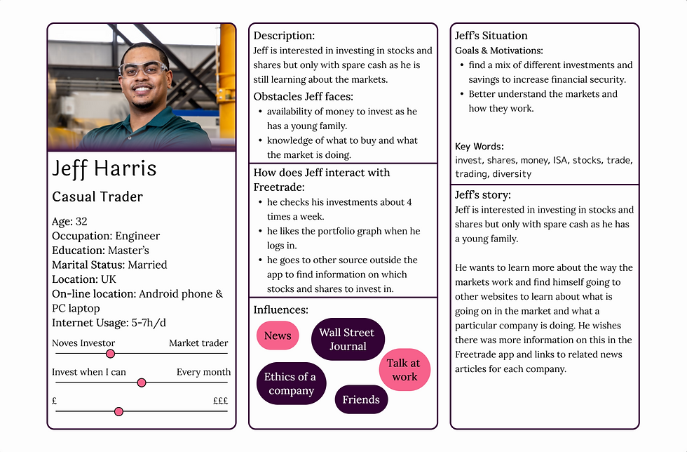
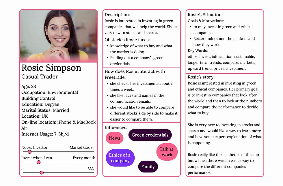
As the sole person working on this project, I created a User Persona and a Journey Map to ensure a user-centred design process and keep the primary user in mind. The Journey Map facilitated the identification of pain points and the design of solutions to address these issues. These deliverables helped me stay focused on user needs and design a solution that would address the pain points identified in the user research.
How do deliverables help the team?
However, if there had been a team involved in the project, these deliverables would have been even more beneficial. A User Persona would have acted as a reference point for the entire team and stakeholders, ensuring that everyone was aligned with the user's needs and goals. These deliverables would create a more collaborative and efficient design process. Overall, User Personas and Journey Maps are essential tools for any team involved in the design process, as they help ensure a user-centred approach and improve collaboration and communication between team members.
What were my deliverables and why?
However, if there had been a team involved in the project, these deliverables would have been even more beneficial. A User Persona would have acted as a reference point for the entire team and stakeholders, ensuring that everyone was aligned with the user's needs and goals. These deliverables would create a more collaborative and efficient design process. Overall, User Personas and Journey Maps are essential tools for any team involved in the design process, as they help ensure a user-centered approach and improve collaboration and communication between team members.
As the sole person working on this project, I created a User Persona and a Journey Map to ensure a user-centered design process and keep the primary user in mind. The Journey Map facilitated the identification of pain points and the design of solutions to address these issues. These deliverables helped me stay focused on user needs and design a solution that would address the pain points identified in the user research.

.png)
Summary
How would I summarise this project?
Based on the user research and competitor analysis, the main challenge identified was that Freetrade users were leaving the app to conduct market research elsewhere. To address this pain point, the solution proposed was to provide users with more in-app market analysis and news to keep them engaged on the app and improve their chances of conversion.
Thank you for taking the time to look at my project. If you would like to know more or if you have a business proposition you would like to discuss please contact me.
To develop a user-centred design solution, a User Persona and Journey Map were created to keep the primary user in mind. From there, ideas were generated and wireframes were tested with users, leading to several iterations of changes to get to the final design.
Feedback from user testing on the Balsamiq revealed that users wanted a mixture of market analysis and news articles in the app. Based on this feedback, a second tab labelled "News" was added next to the "Professional Analysis" tab to provide users with easy access to both types of content.
Overall, the work resulted in a more user-friendly Freetrade app that addressed the pain points of users leaving the app to conduct market research elsewhere. The changes made based on user feedback during the testing phase ensured that the final design was truly user-centred and optimized for user engagement and conversion.

How did I generate a design idea to develop?
After conducting qualitative research and market analysis, I engaged in a brainstorming session to generate design ideas. It became clear from the research that users were leaving the Freetrade app due to a lack of in-app market information. To address this issue, I came up with a design solution: provide more comprehensive market information within the app itself. This solution was based on insights gathered from user research and competitor analysis, and aimed to improve user engagement and retention by offering users valuable market insights and company-specific data within the Freetrade app.
Ideation
Final Solution

What do the competitors offer that Freetrade don't?
During a competitive analysis of Freetrade's competitors, including Vanguard, The Wall Street Journal, and Revolut, several trends became apparent. In comparison to Freetrade, these competitors offered more in terms of visual data and graphs to provide users with a better understanding of the market. Additionally, these competitors provided more in-depth written analysis to help users make informed investment decisions. These findings highlighted an opportunity for Freetrade to enhance its platform by offering a more robust market analysis to keep users engaged and informed.
What were the key takeaways?
From the user research and competitor analysis, several key takeaways emerged. Firstly, users were leaving the Freetrade platform to conduct market research on external sites. Secondly, users appreciated the graphs and percentage increase/decrease information, as well as the ability to purchase fractional shares. Finally, in comparison to some competitors, Freetrade lacked comprehensive information on individual companies. To address these issues, Freetrade needed to enhance its platform by offering more valuable market insights and company-specific data to keep users engaged and informed.

© Unsplash, Fair use
My Role: UX Researcher - UX Designer - UI Designer - Team of one
Tools Used: Pen & Paper - Figma - UXPin - Word - Excel - Google Forms
Time On Project: 4 weeks

The successful idea that was taken forward for more ideation.

These ideas didn't make it through for further development.

The successful ideation that was taken forward.

These ideas didn't make it through for further development.
%201.png)
_edited.png)

.png)
